
Mobile devices have become an integral part of our daily lives, transforming the way we consume content and interact with the online world. As the number of mobile users continues to surge, it has become essential for photography websites to adopt a mobile-friendly design. This article explores the significance of mobile-friendly websites for photographers and provides insights on how to capture the growing mobile audience. Let’s delve into the world of mobile-responsive design and its impact on photography websites.
The Rise of Mobile Users and Its Impact on Photography Websites
The widespread adoption of smartphones and tablets has revolutionized the online landscape, with mobile internet usage surpassing desktop usage. Photography enthusiasts, art lovers, and potential clients now prefer exploring photography portfolios and galleries on their mobile devices, seeking seamless experiences on the go. To cater to this evolving trend, photographers must prioritize mobile-friendly design to engage and retain their audience effectively.
Benefits of Mobile-Friendly Design for Photography Websites
Enhanced User Experience (UX): Mobile-friendly websites offer a superior user experience, optimizing layouts and image display for smaller screens. Responsive design ensures that photographs and content adjust seamlessly, providing an immersive and enjoyable browsing experience for mobile users.
Increased Mobile Traffic and Visibility: Mobile-friendly websites are favored by search engines, resulting in higher mobile search rankings. As a result, photography websites with mobile-responsive design attract more mobile traffic and gain better visibility among potential clients and art enthusiasts.
Faster Loading Times: Mobile users expect websites to load quickly. The mobile-friendly design ensures faster loading times, reducing bounce rates and improving overall website performance.
Key Elements of Mobile-Friendly Design for Photography Websites
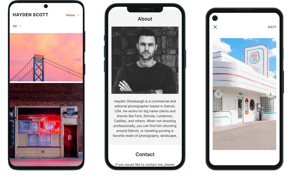
Responsive Web Design: Adopting responsive web design is crucial for photography websites to adapt to various screen sizes and devices. This approach allows content and images to resize automatically, providing an optimal viewing experience for mobile users without compromising on visual quality.
Intuitive Navigation: Streamline the navigation menu and ensure it remains accessible and user-friendly on smaller screens. Mobile users should effortlessly access different sections of your photography website, including portfolios, galleries, and contact information.
Optimized Image Display: Images play a pivotal role in photography websites. Optimize image sizes and formats to reduce load times while maintaining image quality. Utilize responsive image techniques to display images appropriately on various devices.
Mobile-Friendly Contact Forms: Simplify contact forms and ensure they are mobile-friendly, making it easy for potential clients to get in touch with you or inquire about your photography services.
Mobile SEO Best Practices for Photography Websites
Focus on Mobile Keywords: Identify and optimize for mobile-specific keywords that potential clients may use during mobile searches. Local SEO strategies are particularly vital for photographers targeting a specific geographic area.
Mobile Page Speed Optimization: Fast-loading pages are crucial for mobile SEO. Compress images, leverage browser caching, and minimize server response time to improve your photography website’s mobile performance.
Implement Structured Data Markup: Use schema markup to help search engines understand your photography website’s content better. This can lead to rich snippets in search results, enhancing your website’s visibility on mobile devices.
In a mobile-driven world, a mobile-friendly design is no longer an option but a necessity for photography websites. By embracing responsive web design, optimizing image display, and focusing on mobile SEO, photographers can capture the growing mobile audience and offer an exceptional user experience to potential clients and art enthusiasts. As you embark on the journey of mobile-friendly design, remember that adapting to mobile devices not only enhances user satisfaction but also contributes to improved search rankings and increased mobile traffic. Embrace mobile responsiveness to elevate your photography website and showcase your artistic talent to a wider audience, ensuring your work shines brightly in the palm of every mobile user’s hand.
Ready to take your small business marketing to the next level? Trust the experts at Libra Web and Marketing Solutions to help you achieve your goals. Whether you need assistance with SEO, PPC advertising, web design, or social media marketing, our team has the knowledge and expertise to drive results. Contact us today to schedule a consultation and let us tailor a marketing strategy that suits your business needs. Together, let’s unlock the potential of your small business and watch it thrive in the digital landscape. Visit Lwam.co for more information.