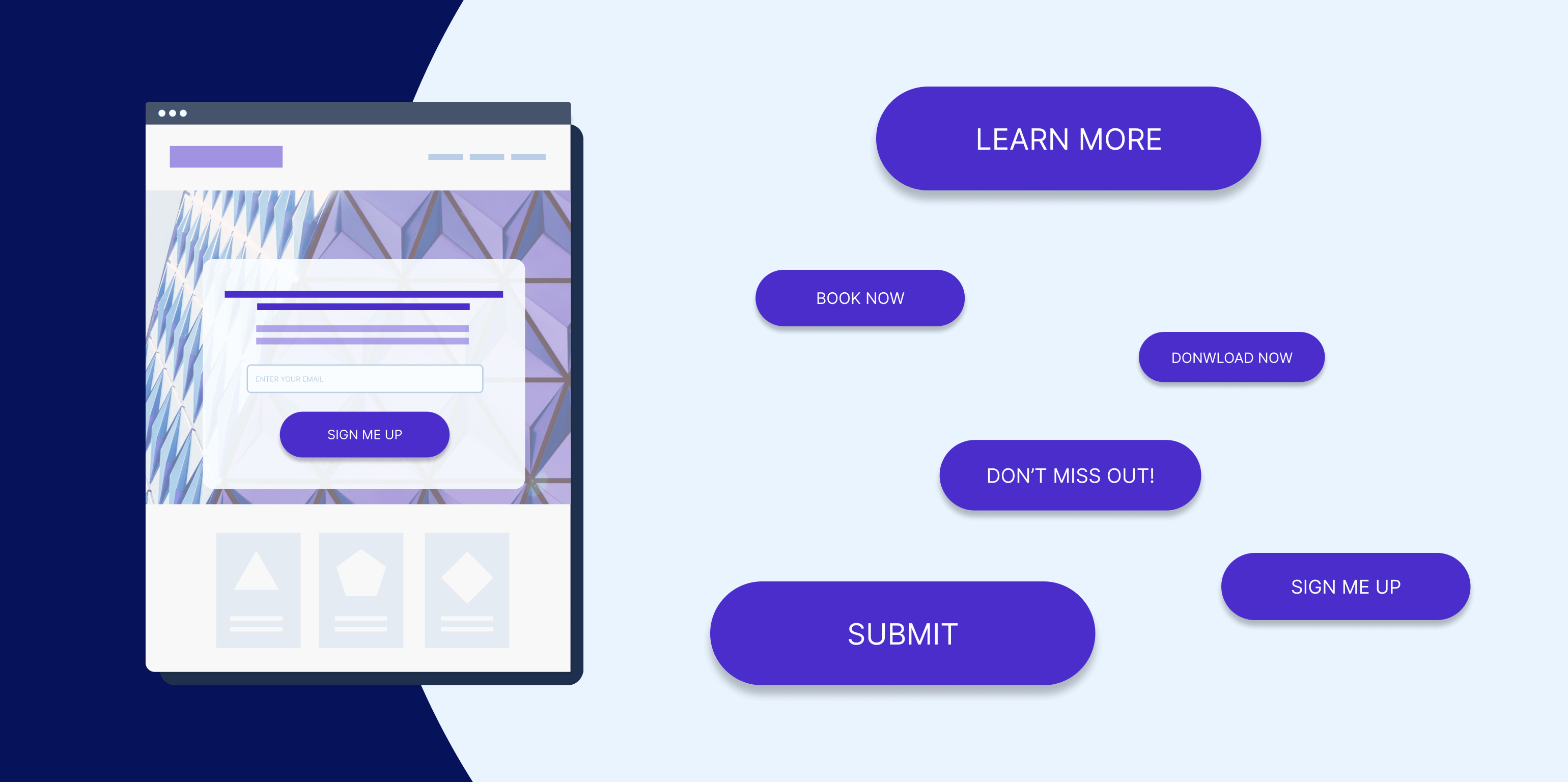
In the dynamic realm of digital marketing, the efficacy of a towing website transcends its design and content—it hinges on its prowess to guide visitors toward meaningful interactions. Central to this success is the Call-to-Action (CTA), a strategic beacon that beckons visitors to take decisive steps, whether it’s seeking a quote, scheduling a service, or seeking immediate help. Effective CTA strategies wield the power to steer users through the decision-making process, transforming fleeting visitors into dedicated patrons. This comprehensive article delves into a treasury of astute CTA strategies designed explicitly for towing websites, unveiling a pathway to heightened engagement, increased conversions, and lasting accomplishments.
The Influence of Call-to-Action: Beyond the Button
A CTA surpasses the status of a mere button—it acts as a catalyst, propelling users towards valuable engagements. Masterfully designed CTAs, placed judiciously across your towing website, can significantly enrich the user experience and bolster conversion rates. Effective CTA strategies are built upon a profound understanding of user intent, their concerns, and a compelling blend of urgency, aligning seamlessly to create a guided journey for visitors.
Be Clear and Action-Oriented
At the core of an effective CTA lies clarity. The purpose of the action should be unmistakable to visitors upon a single glance. Employ language that demands action, steering clear of vague phrases. Opt for direct, specific verbiage like “Request a Quote,” “Get Help Now,” or “Schedule Towing.”
Highlight the Value Proposition
Each CTA should vividly communicate the value visitors stand to gain through their actions. Address their concerns or problems head-on, underscoring how your towing services provide the solution. For instance, a CTA could echo “Regain Road Safety” or “Experience Swift and Dependable Towing.”
Create a Sense of Urgency
The prospect of urgency can prompt action. Seamlessly integrate time-bound language into your CTAs, nudging users toward prompt engagement. Phrases such as “Limited Time Offer,” “Act Now,” or “Don’t Miss Out” can invoke the desired sense of immediacy.
Utilize Contrasting Colors
The CTA button should stand out distinctly from the website’s overall design. Opt for a color that starkly contrasts, capturing users’ attention effortlessly. Studies indicate that colors like orange, red, and green are particularly effective at drawing focus.
Implement Strategic Placement
The placement of your CTA buttons carries as much weight as their design. Leverage the “F-pattern” that mirrors users’ scanning habits. Situate CTAs strategically along this pattern, ensuring their prominence without necessitating excessive scrolling.
Tailor CTAs to Different Journey Stages
Recognize that not all visitors are at the same stage of their decision-making journey. Tailor CTAs to cater to varied needs. Early-stage visitors might benefit from CTAs offering educational resources, while those closer to conversion could engage with CTAs inviting quotes or immediate assistance.
Leverage Social Proof
Infuse social proof into your CTAs to foster trust and credibility. Incorporate phrases like “Join Thousands of Satisfied Customers” or “Trusted by Locals for Over a Decade” to echo the dependability of your towing services.
Embrace Multimedia CTAs
Beyond textual prompts, multimedia elements can enhance engagement. Envisage the use of videos or images that lead to CTAs. For instance, a video showcasing your towing process could be paired with a CTA prompting users to “Experience Stress-Free Towing.”
Offer Free Consultations or Quotes
The allure of something valuable for free can incite user engagement. A CTA offering a free consultation or quote not only invites interaction but also permits you to gather user data for future follow-ups.
A/B Test for Optimization
Testing is a potent ally. A/B testing diverse CTAs, colors, placements, and wording offers insights into user preferences. Continuously analyze results and adapt your CTA strategies accordingly.
Guiding Towards Conversion
In the universe of towing websites, impactful CTA strategies steer users toward consequential actions. By meticulously devising clear, action-oriented CTAs, accentuating value propositions, invoking urgency, employing contrasting colors, judiciously placing CTAs, customizing CTAs for distinct journey stages, leveraging social validation, embracing multimedia dimensions, proposing complimentary consultations or quotes, and refining through A/B testing, towing websites cultivate a user journey marked by seamless guidance.
As the digital landscape evolves, CTA strategies endure as the heart of user engagement and conversions. These shrewd prompts not only shape user actions but transcend static online spaces, metamorphosing into dynamic avenues that actively navigate users toward solutions. The expedition to success unfurls with CTA strategies that resonate, stimulate, and ultimately steer users toward becoming cherished patrons in the towing industry.
Ready to take your small business marketing to the next level? Trust the experts at Libra Web and Marketing Solutions to help you achieve your goals. Whether you need assistance with SEO, PPC advertising, web design, or social media marketing, our team has the knowledge and expertise to drive results. Contact us today to schedule a consultation and let us tailor a marketing strategy that suits your business needs. Together, let’s unlock the potential of your small business and watch it thrive in the digital landscape. Visit Lwam.co for more information.

